Top 10 Most Intimidating Team Logos of Professional Hockey
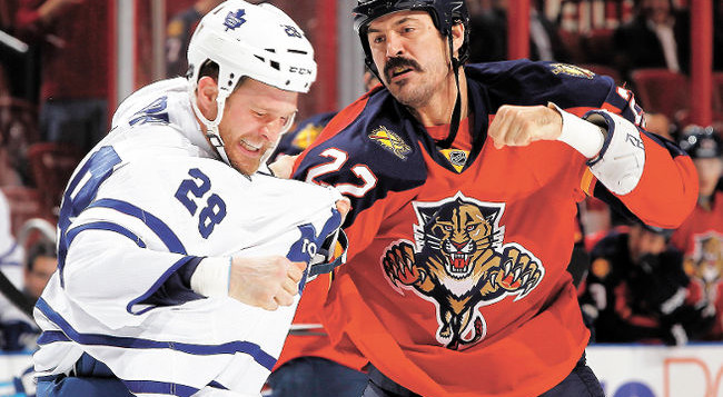
(Source: www.journaldemontreal.com )
In hockey and many other sports, intimidation can go a long way. Some think it can even help a team win the game. There are many ways to intimidate your opponent from showing off your skills in warm-ups, to working out to look bigger, to your uniform design. When it comes to designing a team logo, it’s important to think about what the logo’s purpose is. In the case of hockey, many teams choose to make their logo scary and intimidating while others simply use letters that represent their team name. These team’s designers did a very good job when they created these intimidating designs.
1. Florida Panthers (NHL)
(Source: www.logowallpaper.net)
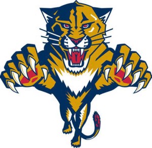
We ranked this logo from the Florida Panthers number one on our list because it is both frightening and promotes a team that is aggressive. It tells opponents that this team is ready to steal the puck from anyone who gets in their way. With the sharp claws, teeth, fierce eyes, and pouncing motion, this logo easily becomes a textbook representation of what most teams seek to accomplish with their emblem.
2. Chicago Wolves (AHL)
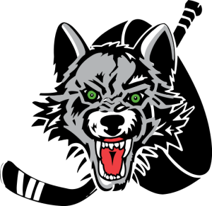
(Source: en.wikipedia.org)
With menacing eyes and a chilling snarl, the Chicago Wolves logo comes in second on our list. In one way or another, this wolf almost looks possessed. The eyes are taunting and instill terror making it another great symbol of a team that’s looking to use psychology to help win the game.
3. Utah Grizzlies (AHL)
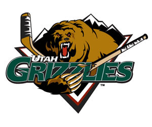
This grizzly is monstrous and terrifying to say the least. With lots of muscles and a clawed paw swinging viciously at the viewer, this logo takes third place on our list. The broken stick also gives an added element of fear and reminds their opponent that the Grizzlies out to destroy.
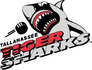
4. Tallahassee Tiger Sharks (ECHL)
Now the Utah Grizzlies, the Tallahassee Tiger Sharks design promotes a team that is hungry for the puck. Like the team, this shark isn’t even afraid of a 60 mph puck flying at him. He will block any shot, no matter how fast, just to lead his team to victory.
5. Manchester Monarchs (AHL)
(Source: hfboards.hockeysfuture.com)
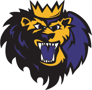
Everyone knows to respect the King of the jungle. He became king for a reason, because he was the toughest, strongest and most cunning animal around. Very few can beat a lion. This image is automatically associates the Monarchs with being number one, and being a force to be reckoned with. This puts the Monarchs’ insignia at number 5 on our list.
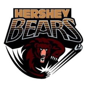
6. Hershey Bears (AHL)
Like the lion, not many people would want to face a bear, and this bear looks frightening. This bears face looks as though he’s growling and ready to attack. As he viciously swats a puck away, the viewer knows that the bear means business. He’s on a mission, and he’s not going to let anything or anyone get in his way.
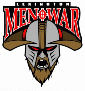
7. Lexington Men O’War (ECHL)
This team is also now the Utah Grizzlies, but with three of their franchise’s logos on our list, you know the team hired a good graphic designer and mean business. With a partially hidden face, horns, beard, and red eyes, this mascot is a fearless and ruthless warrior.
8. Columbus Cottonmouths (ECHL)
(Source: www.muscogeemoms.com)
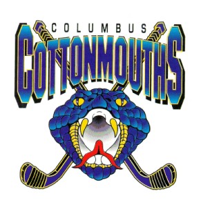
A snake may be small and seem non-threatening, but in fact many people are terrified of snakes. Plus, if they are venomous, they can take you out simply by piercing your skin with their fangs. With this insignia many will also relate the crossed hockey sticks with the skull and bones symbol of a pirate which gives this design an added effect.
9. Nashville Predators (NHL)
(Source: www.sports-logos-screensavers.com)
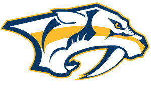
This logo may not have the drama of having the mascot facing you, but it’s definitely scary in its own right. Just look at the size of those teeth. Who wouldn’t be intimidated? The Predators name also establishes intimidation and tells everyone that this team is on the hunt and seeking to get what they want.
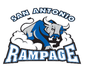
10. San Antonio Rampage (AHL)
(Source: www.eventfinda.com)
In many countries, bullfighting is a test of strength, cunning and endurance. With this emblem the San Antonio Rampage is telling their opponents that if they want to play their team, they will definitely be put to the test.
The logo is a very important part of a team. In most cases, it is what the public ends up associating both the team and city with. Depending on the image depicted, the font, and the colors used, the team can send all types of messages. Many teams opt for large and beastly animals to help their team seem intimidating. They hope to subconsciously sneak into the minds of their opponents, make them uneasy, and ultimately make them lose their focus. This way they can both build a status and rack up some wins.
